
30 agosto 2006
CANCIONES QUE NO ME PUEDO SACAR DE LA CABEZA
"Simple Together"
Alanis Morissette
You've been my golden best friend
And now with post-demise at hand
I can't go to you for consolation
Cuz we're off limits during this transition
This grief overwhelms me
It burns in my stomach
And I can't stop bumping into things
I thought we'd be simple together
I thought we'd be happy together
thought we'd be limitless together
I thought we'd be precious together
But I was sadly mistaken
You've been my soulmate and then some
I remembered you the moment I met you
With you I knew god's face was handsome
With you I saw fun and expansion
This loss is numbing me it pierces my chest
And I can't stop dropping everything
I thought we'd be sexy together
thought we'd be evolving together
I thought we'd have children together
I thought we'd be family together
But I was sadly mistaken
If I had a bill for all the philosophies I shared
If I had a penny for all the possibilities I presented
If I had a dime for every hand thrown up in the air
My wealth would render this no less severe
I thought we'd be genius together
I thought we'd be healing together
I thought we'd be growing together
thought we'd be adventurous together
But I was sadly mistaken
thought we'd be exploring together
thought we'd be inspired together
I thought we'd be flying together
thought we'd be on fire together
but I was sadly mistaken
28 agosto 2006
EL QUE MUCHO ABARCA...
...poco aprieta.
Tema 1: Cepillos de dientes. El segundo, también marca Oral B, pertenece a mi amiga Carolina Magud, quién se acaba de separar del novio después de 9 años de noviazgo y otros tantos de convivencia. Para ellos hice el cartel que pueden ver aquí.
Cómo no tenía muchas opciones para ir a vivir al dejar la casa que compartieron con el novio, le ofrecí un lugar en mi living, qué es dónde está durmiendo desde hace hoy, 3 semanas.
¿Hablando en castellano? No me la estoy empomando. Nadie me cree. Por ahí si lo digo de frente, eso cambia.
Tema 2: Esta aclaración era destinada a la Srta. que me acaba de mandar un .pps que me hizo pensar y reír mucho. De ese .pps surge las siguientes dos dudas existenciales:
a) ¿Por qué es que los archivillanos están siempre tratando de destruír el planeta? ¿Dónde mierda piensan vivir una vez que tengan éxito?
b) ¿Por qué es que los Picapiedras festejan la navidad si existieron antes de Cristo?
24 agosto 2006
PERLAS DE SABIDURÍA #7
"You can shine like silver all you want,
but you´re just aluminum."
Aluminum
Barenaked Ladies
23 agosto 2006
"THE CIRCLE IS NOW COMPLETE"
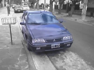
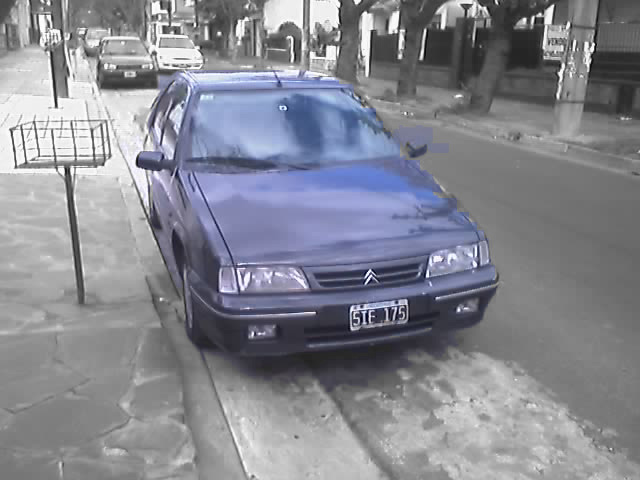
En tan solo 1 año calendario recuperé -hard work mediante- todo lo que tenía antes de irme de viaje. Esta es una breve historia gráfica -de memoria selectiva- de ese año.
15 de Mayo del 2005: Aterricé en Buenos Aires con solo U$S100 en mi haber.
 6 de Julio del 2006: Tu-tu.
  1 de Julio del 2005: Conseguí trabajo
 6 de Julio del 2006: Citroën.
1 de Agosto del 2005: Alquilé casa.
6 de Julio del 2006: Citroën.
1 de Agosto del 2005: Alquilé casa.
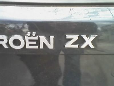 6 de Julio del 2006: ZX
14 de Febrero del 2006: Compré cama
6 de Julio del 2006: ZX
14 de Febrero del 2006: Compré cama
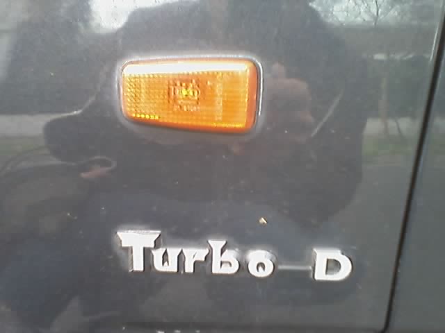
 6 de Julio del 2006: Turbo Diesel.
 6 de Julio del 2006: Tu-tu.
1 de Julio del 2005: Conseguí trabajo
6 de Julio del 2006: Tu-tu.
1 de Julio del 2005: Conseguí trabajo
 6 de Julio del 2006: Citroën.
1 de Agosto del 2005: Alquilé casa.
6 de Julio del 2006: Citroën.
1 de Agosto del 2005: Alquilé casa.
 6 de Julio del 2006: ZX
14 de Febrero del 2006: Compré cama
6 de Julio del 2006: ZX
14 de Febrero del 2006: Compré cama
 6 de Julio del 2006: Turbo Diesel.
21 agosto 2006
EFEMÉRDIES de CONVIVENCIA
 Hoy hace 15 días que hay 2 cepillos de dientes en mi baño... y no, los dos no son míos.
 20 agosto 2006
"GEORGE LUCAS in LOVE"
| Duración 9 min. Hablado en Inglés sin subtítulos (Sorry!). Uno de los mejores cortos que ví en mi vida. | |
16 agosto 2006
CUANDO ESTAR TIESO ES ALGO MALO
El Rigor mortis es un signo reconocible de muerte (del latín mortis) que es causado por un cambio químico en los músculos que causa un estado de rigidez (del latín rigor) e inflexibilidad en las extremidades y una dificultad para mover o manipular el cadáver. A una temperatura normal el rigor mortis suele aparecer a las 3-4 horas después de la muerte clínica y el rigor suele tener un efecto completo sobre las 12 horas. Finalmente se suaviza esta rigidez a las 36 horas cuando los músculos se descomponen, proceso que es acelerado por el ácido láctico residual de la obtención de ATP, el termino “tieso” que se les da a los muertos proviene de este fenómeno.
Originalmente publicado en Wikipedia. Leer artículo.
15 agosto 2006
NI MUY MUY NI TAN TAN
¿Cómo se hace para no tomar partido teniendo gente querida en zona de conflicto?
Soy un convencido de que la muerte de un civil afgano, de un civil irakí, de un civil yankee o de un civil argentino, de un católico, de un judío o de un musulmán es igual de trágica. La muerte no discrimina y creo que nosotros tampoco deberíamos.
Creo que es muy difícil tomar bandos en la guerra Israel-Hezbollah (que no considero que sea Israel-Líbano). Creo que hay foul-play de ambos lados. También creo que es inevitable caer en una discusión tipo ¿Qué fue primero, el huevo o la gallina?, si se aborda este tema.
Personalmente, la discusión se termina cuándo hay gente querida en zona de conflicto. Ese va a ser mi bando. No por mérito o nacionalidad, por vínculo. En este caso, ese bando es Israel, como mis fieles lectores saben.
Un costado trágico de este conflicto, que me parece muy arraigado a los conflictos del Oriente Medio desde que tengo uso de razón, es la manipulación de los medios para ganar la batalla de la opinión pública.
Me parece inadmisible de un diario de la talla de The Washington Post.
 Levántate y anda!: El Lázaro moderno.
 Levántate y anda!: El Lázaro moderno.
14 agosto 2006
FRAGMENTOS DE PASIÓN
Andriu dice:
Te conté que puse la cámara en venta?
Juan dice:
C-U-A-L?
Andriu dice:
LA cámara
Andriu dice:
La única que tengo
Andriu dice:
La de fotos me la robaron
Juan dice:
por que?!?!?!? game over?
Andriu dice:
Basta para mí, basta para todos
Juan dice:
te canso , te aburrió
Andriu dice:
NO me mueve más las ganas de filmar
Juan dice:
si me lo habias dicho, pero pense que quiza...
Andriu dice:
...hace rato...
Juan dice:
era algo del momento
Andriu dice:
Parece que no
Andriu dice:
Guarda, me alucina contar historias,
Juan dice:
no lo dudo
Andriu dice:
Pero no más filmarlas
Juan dice:
igual, nunca digas de esta agua no he de beber . . . who knows?
Andriu dice:
Si te interesa, te la vendo
Andriu dice:
Who knows?
Andriu dice:
Pero hace ya unos años que la tengo juntando polvo
Andriu dice:
Y si algún día quiero hacer algo, lo haré en video...
Juan dice:
claro... yo tambien le tengo ganas a una camara que graba directamente en DVD
Andriu dice:
Claro!
Juan dice:
pero me da saudade la de 16
Juan dice:
me da cosita
Andriu dice:
A mi también, pero esa guita la puedo usar para cosas que me apasionen más.
Juan dice:
si, es verdad, no hay que atarse a objetos, por mas que hayan sido compañeros de
emociones
Andriu dice:
Ni hablar
Andriu dice:
Por más fetichistas que seamos
Juan dice:
si, sino al final te convertis a la larga en un viejo coleccionista
Andriu dice:
...y pobre!
Juan dice:
pero si esa camara hablara .. .
Andriu dice:
Mierda que nos habremos desvelado al rededor de la cámara esa!
Andriu dice:
Cuánta pasión!
Andriu dice:
Me pregunto a dónde habrá ido esa pasión mía?
Juan dice:
quemandonos las pestañas para cambiar las bobinas
Andriu dice:
sin velar el material!
13 agosto 2006
UNDERGROUND TYPOGRAPHY
John D. Berry journeys through the bowels of our transit systems in search of enlightenment and a few clear directions.
By John D. Berry
Friday, March 23, 2001
There are few more obviously functional forms of environmental typography than the signage in a subway or other transit system. A couple of years ago, I found myself riding the subways of New York, London, and Paris, all in the space of the same month. This gave me an unusual opportunity to compare the three systems firsthand, and to judge which was easiest to navigate.
All three cities have had subways for a long time, so their subway systems have become conglomerations of once-independent underground rail lines, and palimpsests of various systems of naming, numbering, and signage imposed over the decades. The hodgepodge nature of the subways makes their signage all the more important.
From End to End in Paris
The Paris Metro is the simplest, conceptually. Each line runs simply from one end to the other, without branching off into multiple directions (usually), and each is identified by the name of the station on either end. The trouble is that several of the lines have been extended since I first learned the system many years ago, and they are consequently identified by the names of the new stations that now terminate the lines. Luckily, each line is also numbered, and the numbers seem to be given more prominence since the expansion than they used to be.
The signage typefaces vary, but quite a lot of the signs are in a face designed for the purpose by Adrian Frutiger (creator of Univers and the eponymous type family Frutiger), which serves admirably. More recently, Jean-François Porchez developed a new typeface for Metro signage -- one that also works well. Finding the correct train is generally easy, even in a complicated station -- even, in fact, where construction has made it necessary to direct riders who are changing lines outside the station itself, across a square, and through parts of a large train station in order to reach the connecting subway line. But it's not always easy to spot the name of the station as you're pulling in.
Knowing Where You Are in London
The London Underground is famous for its bold, clear station signs, with the easy-to-spot logo of circle and red bar, and for its completely stylized, nearly abstract system map (to download a 1MB version, click here) -- the first of its kind when it came out early in the last century. The map tells you nothing about the land over your head, but it provides a perfectly understandable schematic of the system itself. (It cannot, however, do much to warn you about the vast distances between "connecting" lines in complex tangles like Paddington Station. The signs directing you through that major rail terminus to the various Underground lines are numerous but misleading.)
What struck me most about the London system, however, was that on every train I rode, it was always possible to see (unless someone was standing in my way) the name of the station clearly displayed outside the window on either side. Not only are there signs at very frequent intervals along the platforms, but there are signs all along the wall on the far side of the tracks, too -- and they align perfectly with the windows of the cars. For clarity and, most of all, consistency, London wins hands down.
Local Knowledge in New York City
The New York subway system, as you might guess, is the most chaotic as well as the most complex. It's really not right to call it a "system"; it is many systems, laid on top of each other over the years, and many, many exceptions. (It's sort of like the English language, where the exceptions seem to outnumber the rules.) When I moved back there three years ago, it took me months of frustration before I remembered what I'd forgotten: that New Yorkers take great pride and perverse delight in mastering the intricacies of their subways, like inhabitants of a great forest knowing how to find the watering-hole where the bears like to gather. The lines have all been numbered or lettered, and color-coded, for more than thirty years, but you still hear people referring blithely to the "East Side IRT" or the "Lexington Avenue Local."
New York subway lines are now designated with single letters or numbers. The signage uses a version of Aksidenz Grotesk, a precursor to Helvetica.
When I first started riding the New York subways, in the late '60s, this system had just been instituted in an attempt to impose a rational overlay on the organic chaos of daily travel. As I learned much later, it was Massimo Vignelli and his design office who gave Gotham a new, consistent system, and he took the idea behind the London Underground map one step farther, in creating the now-famous wiring-diagram map of New York's vastly complicated subway lines. Today's map is a compromise -- equally complex, but much more organic.
It was a marvelous conceptual map, and it was easy to read. It was a tool for navigating the subways, although not one for navigating the city streets; you had to know where you were going. (Only recently did I find out that Vignelli had planned a second, complementary map that would have been more tied to the actual above-ground geography. The city never let him do it.) There were landmarks that I knew only as subway stations, where I changed trains deep underground without ever knowing what the streets and buildings above me looked like. But it was easy to navigate within the system itself.
The one exception was one I ran afoul of when I was first learning my way around, and it was the result, I assume, of the time it takes to actually implement any ambitious system of re-labeling an entire city. The new maps identified the lines solely by their letters or numbers, not by the names of the three formerly separate transit companies that had been united (the IRT, the BMT, and the IND). But in stations where lines from two or more of the old companies crossed, the actual signs you'd see embedded in the tile walls often said, "IRT Uptown" or "This Way to BMT Trains." It was a while before the colorful new circles with their identifying numbers or letters were installed in all the hundreds of stations.
That's not a problem now. With all the Vignelli-inspired signs in their bold, '60s-looking sans serif (a version of Aksidenz Grotesk, the precursor of Helvetica), there's a consistency to much of the signage in New York's underground. But the walls are still full of much older signs -- tiles and carved plaster and plaques with curlicues -- as well as some more recent attempts at updating the system that don't work particularly well. These signs, old and new, appear at all sorts of different heights and positions, and the various kinds of subway cars all seem to have different windows on varying levels, with plenty of posts and sign-holders blocking the view in inconsistent ways. All this adds up to a situation where often you can't look out the train window and tell what station you're in. (During rush hour, when I was jammed in among a crush of fellow commuters and could only see a small patch of station platform between the arms, legs, and newspapers, I learned to recognize prominent stations by the patterns of construction in their walls. "Oh, it's Fourteenth Street. Three more stops.")
The walls of some stations in the New York subway system still direct riders to the long-merged IRT, BMT, or IND lines.
The most counter-productive contribution to this signage mess is what appears to be an attempt to save on materials and installation costs by putting the name of the station only on every other one of the pillars that march down many station platforms, rather than on each pillar. This is not very useful if your car stops in front of one of the unlabeled pillars. In addition, the newer signs are only found on the front and back sides of the pillars, as though subway riders were suburban commuters facing forward or back in their seats; the old, tiled signs, with their peculiar abbreviations so that long names could fit ("BL'KER" for Bleeker), at least appear on all four sides of the pillars, so they can be read from any direction.
In the New York subway system, old and new styles of signage exist side by side.
Audiovisual Aids
When the station signage is inadequate, you have to rely on getting your information inside the car itself.
The last time I was in New York, I got to ride one of the brand-new cars, designed by Antenna Design, which have been getting a lot of notice in the design press. (Only a few are on the tracks thus far.) In practice, when they pull up to a station platform and you get on, they don't seem all that radically different from the old "Redbird" cars (which, according to press reports, may soon find their decommissioned carcasses lying full fathom five off the New Jersey and Long Island coasts, as "artificial reefs" to attract fish). The new cars seem practical and unusually pleasant, but ultimately they're just a new style, not a wildly different approach to riding the subway. They've got the same old ads for Dr. Z's skin-care treatments.
But they do have, unlike anything seen on New York's subway lines before, prerecorded announcements of the train's next stop, and little lights on a diagram of the stations on that line to tell you where you are and which direction you're going. (They also have noticeably wider doors than the old cars, which ought to speed things up at rush hour.) The voice of the automated announcements does not have a New York accent, sadly, but it does have the virtue of being clear and easy to understand. I'm sure that New Yorkers are already complaining that this clarity takes the fun out of things, and are prematurely pining for the highly personal and unpredictable voices that would squawk, warble, gargle, murmur, shriek, and otherwise pretend to communicate information over a PA system that was always tuned either too soft or way, way too loud.
But automated systems have to work right.
In London a couple of years ago, I was riding one of the new, automated cars on the Northern Line (which used to have the oldest, grottiest cars in the Underground -- and still does, sometimes), admiring the improvements to comfort, décor, and clarity of announcements, when I realized that the automated voice was just a few beats off in its timing. The doors would open, people would get on and off, and the doors would be just starting to slide shut when the voice announced the station stop. Still a few bugs in the system.
In Boston, which also recently started using new cars with automated station announcements, I was riding the Red Line in from Braintree and listening to the prerecorded voice announce, "Next stop: Quincy Adams." Unfortunately, it repeated the same thing at every station -- "Next stop: Quincy Adams" -- as it left the Quincy Adams stop behind and trundled farther and farther into the heart of the city.
Finding Our Way Through the Mess
It's amazing, sometimes, how inadequate the information design can be in a transit system. In Seattle, where I lived for many years, there is no subway per se, but the transit system spent a huge amount of time and money building an underground bus tunnel through downtown (in which they laid tracks, in case they later decided to run light-rail trains). There are only a handful of stations, but for some reason, each has an entirely different style of signs for the station name. As a friend pointed out when we were talking about the subject of this column, "The first thing I do when I get into a city's transit system is look around and figure out what style of lettering the information is in. Here in Seattle, in the bus tunnel, there is no style." Just to make it a little harder, the station names are designed to be easily readable if you're standing in front of them -- but not necessarily if you're looking at them at an extreme angle as you come into the station on a bus.
In San Francisco, the original signs in the BART stations are so discreet that they blend into the background (though perhaps they stood out when they were fresh and new). The lettering is actually quite clear, and very well spaced to be readable from any angle; it's just that the signs themselves are too few, too subtly positioned, almost too self-effacing.
There is no perfect signage system, just as there is no perfect transit system. We live in unruly, jumbled human agglomerations, which, no matter how huge they may be, are made up of lots of local places and individual people in unique, interlocking communities and neighborhoods. But it's very, very useful when someone can recognize the patterns of all that urban life and translate it into information, and then make that information -- simplified, systematized, and clearly marked -- available to all the people rushing about their business through the streets and tunnels.
BLOGGING ESSAY
http://www.rebeccablood.net/essays/weblog_history.html
http://www.rebeccablood.net/handbook/excerpts/weblog_ethics.html
http://www.rebeccablood.net/essays/ten_tips.html
http://www.rebeccablood.net/handbook/excerpts/weblog_ethics.html
http://www.rebeccablood.net/essays/ten_tips.html
12 agosto 2006

10 agosto 2006
PERLAS DE SABIDURÍA #6
Hoy me maravillé al escuchar esta joya del saber popular en una serie y no pude resistir la tentación de adueñármela.
Ley de Grant: Dícese del principio y/o tratado y/o estatuto que demuestra y/o determina y/o ratifica que nosotros los hombres, nunca nos conformamos, ni nos vamos a conformar con nada. Siempre vamos a querer lo que no podemos tener.
Bautizada así en honor a su máximo expositor: Hugh Grant.
 Salameeeeeeee.....
Este zapallo salía con una de las 5 mujeres más voluptuosas y deseadas del planeta (Liz Hurley)...
Salameeeeeeee.....
Este zapallo salía con una de las 5 mujeres más voluptuosas y deseadas del planeta (Liz Hurley)...
 Diosaaaaaaaa... Me comprás solo con el acento!
...y aún así no estaba satisfecho. ¡Quería más! ¡Quería lo que no podía tener! ...y se fue a buscar eso que no podía tener: una trola barata comunmente confundida con un travesti (Divine Brown).
Diosaaaaaaaa... Me comprás solo con el acento!
...y aún así no estaba satisfecho. ¡Quería más! ¡Quería lo que no podía tener! ...y se fue a buscar eso que no podía tener: una trola barata comunmente confundida con un travesti (Divine Brown).
 Travestiiiiiiiii...
Perfecto ejemplo de que nunca vamos a estar conformes con nada.
En este humilde homenaje se promulga la ley. Que conste en actas.
Travestiiiiiiiii...
Perfecto ejemplo de que nunca vamos a estar conformes con nada.
En este humilde homenaje se promulga la ley. Que conste en actas.
 Salameeeeeeee.....
  Diosaaaaaaaa... Me comprás solo con el acento!
  Travestiiiiiiiii...
 09 agosto 2006
08 agosto 2006
THE DANCE OF PROSPECTIVE LOVERS
Es increíble la programación de Cosmopolitan TV.
Mejor dicho, lo bizarro de su programación debe ser directamente proporcional a la psicopatología congénita femenina.
La otra noche, más increíblemente aún, me topé con algo bueno.
Un estudio antropológico sobre los ritos de apareamiento -algo que no sería extraño ver en Animal Planet- pero del Homo Sapiens Sapiens... Es decir: ¡Nuestro!
Con el mismo detalle que los zoologos que se esconden en los matorrales africanos vestidos color caqui para observar a las marmotas, estos psicólogos se escondían en bares, disfrazados de seres humanos y tomaban notas. No pararon hasta haber encontrado el patrón detrás de las conquistas (exitosas y fracasadas) en esos sórdidos lugares oscuros y llenos de humo a los que vamos para divertirnos.
El informe estaba tan bueno que me aventuré en pata a través del piso helado de la madrugada, desde la cama hasta el living en busca de algo para anotar.
He aquí una transcripción de lo experimentado.
Paso 1
Suele comenzar con una hembra en busca de acción. Esta suele empezar a mirar a su alrededor. A esta mirada se la llama "Mírenme" o "I´m open for action".
Paso 2
Ella hace contacto visual con un macho. Al mirarse mutuamente se expresan la atracción mutua (valga la redundancia). Una cosa que el macho debe evitar, ya que tiene fines catastróficos, es mirar a la hembra de arriba a abajo, de punta a punta.
Paso 3
La hembra empieza a gesticular para que el macho se acerque. Entre los gestos e encuentran los siguientes: miradas furtivas, excesivo arreglarse el pelo, excesivo arreglarse la ropa, gestos bruscos, exageración de la actitud "¡Qué bien que la estoy pasando!". Si el macho no la mira periódicamente, la hembra va a salir a buscar a otro macho.
Está comprabodo y documentado que:
-Las hembras que realizan este ritual, son aproximadas por machos en celo un promedio de 4 veces por hora.
-Las hembras que no dan señales de vida inginal, son aproximadas por machos alrededor de 1 vez cada 2 horas.
Paso 4
Encararla. Acercarse físicamente. Este paso suele ser dado por el macho. Al principio se observa como ambos cuerpos describen una posición de "v", sin enfrentarse del todo. Dejando espacio para huir despavoridamente.
Paso 5
El contacto físico. Generalmente es la mujer quién toca primero. Si el primer contacto es rechazado, todo se hecha a perder.
Paso 6
Sincronización de Movimientos: Ambos cuerpos, ya plenamente enfrentados, se sincronizan. Cuándo uno bebe, el otro bebe al mismo tiempo. Cuándo uno se arregla el pelo el otro lo imita. Cuándo uno se acerca el otro se acerca, etc.
Paso 7
Beso. Signo internacional de la atracción.
Paso 8
Sexo. No necesitan un manual de instrucciones para eso, ¿no?.
Así que ya saben (que es lo que hicieron mal todos estos años, marmotas). A refinar técnicas, que ninguno se está poniendo más flaco o más lindoooooo!!!
07 agosto 2006
VACACIONES DE INVIERNO
Por fin se terminaron las vacaciones de invierno. Eso de que los chicos menores de 18 años puedan ir corriendo libres por las calles a cualquier hora del día es algo que tenemos que evitar a toda costa.
Eso sí, ahora ni los perros vienen al cine.


04 agosto 2006
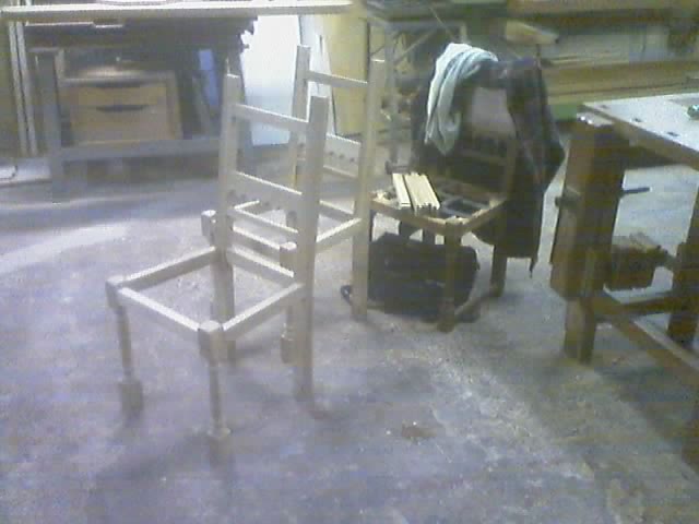
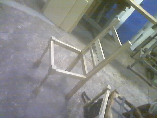
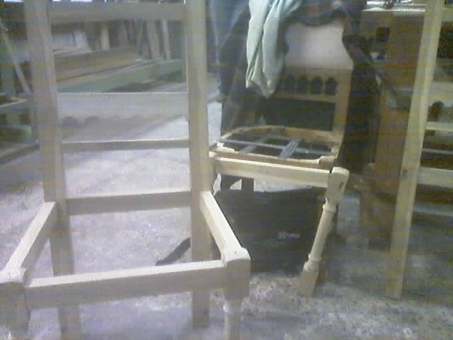
¿DÓNDE PONER EL CULO?
Hoy terminé las sillas...
 ...que empecé en Octubre del año pasado.
 Son las primeras sillas que hago...
 ...y por cierto las últimas.
 Cuándo no tengan dónde apoyar el culo...
 ...se las presto para que las prueben.
 ...que empecé en Octubre del año pasado.
 Son las primeras sillas que hago...
 ...y por cierto las últimas.
 Cuándo no tengan dónde apoyar el culo...
 ...se las presto para que las prueben.
03 agosto 2006

02 agosto 2006

01 agosto 2006
ES UN PÁJARO... ES UN AVIÓN...
 FIESTA DE DISFRACES 22 Jul 06: ¿Qué tal ese rulo?
PRODUCT PLACEMENT es el roñoso recurso que Hollywood utiliza para financiar sus super-producciones pochocleras. Consiste en el descarado y para nada sutíl arte de mostrar productos consumidos en cuadro por los protagonistas y facturarles a los fabricantes. Algunos desfachatados ejemplos de Superman son:
Los trencitos de juguete de Lex Luthor son marca Marklïn.
Los monitores de LCD del Daily Planet son marca Samsung.
Los auriculares del piloto de helicóptero -y secuaz de Lex- son marca Bose.
El celular de Lois Lane es marca Samsung.
FIESTA DE DISFRACES 22 Jul 06: ¿Qué tal ese rulo?
PRODUCT PLACEMENT es el roñoso recurso que Hollywood utiliza para financiar sus super-producciones pochocleras. Consiste en el descarado y para nada sutíl arte de mostrar productos consumidos en cuadro por los protagonistas y facturarles a los fabricantes. Algunos desfachatados ejemplos de Superman son:
Los trencitos de juguete de Lex Luthor son marca Marklïn.
Los monitores de LCD del Daily Planet son marca Samsung.
Los auriculares del piloto de helicóptero -y secuaz de Lex- son marca Bose.
El celular de Lois Lane es marca Samsung.
 FIESTA DE DISFRACES 22 Jul 06: Practicando en casa antes de ir a la fiesta.
CURIOSIDADES
La maqueta de Lex tiene un cartel que dice que se trata de Smallville.
Clark, en el flashback de cuándo aprende a volar a los 12 años, usa anteojos, lo cuál es históricamente equivocado.
FIESTA DE DISFRACES 22 Jul 06: Practicando en casa antes de ir a la fiesta.
CURIOSIDADES
La maqueta de Lex tiene un cartel que dice que se trata de Smallville.
Clark, en el flashback de cuándo aprende a volar a los 12 años, usa anteojos, lo cuál es históricamente equivocado.
 FIESTA DE DISFRACES 22 Jul 06: Clark ya medio ebrio y sin poder volar derecho.
Los dejo con una inquietud. Superman nunca tiene barba. Ni siquiera se lo ve con five o´clock shadow. Pero si él es de acero, es lógico pensar que sus pelos también lo son. Entonces, ¿cómo hace para afeitarse?
FIESTA DE DISFRACES 22 Jul 06: Clark ya medio ebrio y sin poder volar derecho.
Los dejo con una inquietud. Superman nunca tiene barba. Ni siquiera se lo ve con five o´clock shadow. Pero si él es de acero, es lógico pensar que sus pelos también lo son. Entonces, ¿cómo hace para afeitarse?
Suscribirse a:
Entradas (Atom)